Plotting#

PyProBE includes compatibility with multiple open plotting libraries in Python. This example will go through interacting with each of them.

Start by importing PyProBE and the dataset:

[1]:
%%capture
%pip install matplotlib
[2]:
import pyprobe
import matplotlib.pyplot as plt

%matplotlib inline
[3]:
info_dictionary = {
    "Name": "Sample cell",
    "Chemistry": "NMC622",
    "Nominal Capacity [Ah]": 0.04,
    "Cycler number": 1,
    "Channel number": 1,
}
data_directory = "../../../tests/sample_data/neware"

# Create a cell object
cell = pyprobe.Cell(info=info_dictionary)
cell.add_procedure(
    procedure_name="Sample",
    folder_path=data_directory,
    filename="sample_data_neware.parquet",
)

Pandas/Matplotlib#

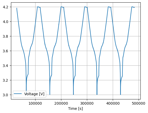
Matplotlib is one of the most popular plotting libraries in Python. Pandas dataframes include a built-in plot() method to construct plots using Matplotlib, which is also integrated into PyProBE Result objects.

Call plot() on any result object and control the method exactly as you would expect to with Pandas:

[4]:
plt.figure()
cell.procedure["Sample"].experiment("Break-in Cycles").plot(
    x="Time [s]", y="Voltage [V]", grid=True
)
[4]:
<Axes: xlabel='Time [s]'>
<Figure size 640x480 with 0 Axes>
../_images/examples_plotting_7_2.png

HvPlot#

Plots created using Matplotlib sometimes need a lot of work to look good, and they are not particularly interactive. HvPlot provides a high-level interface similar to plotting in pandas with the additional flexibility of specifying a more interactive backend. Note hvplot is an optional dependency, it can be installed seperately to enable this functionality.

[5]:
cell.procedure["Sample"].experiment("Break-in Cycles").hvplot(
    x="Time [s]", y="Voltage [V]"
)
[5]:

Seaborn#

Seaborn is a high-level plotting library built on top of matplotlib. It provides a clean interface for dataframes, while maintaining much of matplotlib’s flexibility.

In PyProBE you can import a version of Seaborn customized to work with PyProBE objects directly:

[6]:
from pyprobe.plot import seaborn as sns

This version of Seaborn can be interacted with as normal. The only difference is you are able to pass PyProBE Result objects directly to Seaborn plotting functions in their data argument:

[7]:
sns.lineplot(
    data=cell.procedure["Sample"].experiment("Break-in Cycles"),
    x="Time [s]",
    y="Voltage [V]",
)
[7]:
<Axes: xlabel='Time [s]', ylabel='Voltage [V]'>
../_images/examples_plotting_13_1.png

Being built on matplotlib, Seaborn can interact natively with customisation features like subplots:

[8]:
fig, ax = plt.subplots(2, 1, figsize=(8, 6))
sns.lineplot(
    data=cell.procedure["Sample"].experiment("Break-in Cycles"),
    x="Time [s]",
    y="Voltage [V]",
    ax=ax[0],
)
sns.lineplot(
    data=cell.procedure["Sample"].experiment("Break-in Cycles"),
    x="Time [s]",
    y="Current [A]",
    ax=ax[1],
)
plt.tight_layout()
plt.show()
../_images/examples_plotting_15_0.png

Similarly, plots with two y axes can be created as usual:

[9]:
fig, ax = plt.subplots(figsize=(12, 6))
sns.lineplot(
    data=cell.procedure["Sample"].experiment("Break-in Cycles").cycle(-1),
    x="Time [s]",
    y="Voltage [V]",
    ax=ax,
)
ax2 = ax.twinx()
sns.lineplot(
    data=cell.procedure["Sample"].experiment("Break-in Cycles").cycle(-1),
    x="Time [s]",
    y="Current [A]",
    ax=ax2,
    color="r",
)
plt.show()
../_images/examples_plotting_17_0.png

As for all the plotting methods demonstrated, built-in unit conversion is also present:

[10]:
fig, ax = plt.subplots(figsize=(12, 6))
sns.lineplot(
    data=cell.procedure["Sample"].experiment("Break-in Cycles").cycle(-1),
    x="Time [hr]",
    y="Voltage [V]",
    ax=ax,
)
ax2 = ax.twinx()
sns.lineplot(
    data=cell.procedure["Sample"].experiment("Break-in Cycles").cycle(-1),
    x="Time [hr]",
    y="Current [mA]",
    ax=ax2,
    color="r",
)
plt.show()
../_images/examples_plotting_19_0.png