Microclimate sensor data analysis in R
This tutorial is designed for ecologists and environmental scientists with basic R skills. You will learn how to analyze microclimate data collected with an EasyLog USB datalogger, focusing on loading, cleaning, and exploring, environmental time series data.
By the end of this tutorial, you will be able to:
Load and combine multiple sensor CSV files and habitat classification data from Excel files
Clean your dataset and check for data quality issues
Identify and flag potential outliers using different methods
Visualize microclimate trends over time and across sites
Perform basic statistical summaries
Fit ANOVA to explore ecological relationships
Export cleaned data for further analysis
The skills and methods you learn here apply broadly to other environmental datasets.
Load required libraries
You will use several R packages that simplify data manipulation, date handling, and plotting:
library(ggplot2)
library(dplyr)
library(janitor)     # for cleaning column names and general tidying
library(patchwork)   # for combining plots
Set up file paths
In this practical, we expect to find the sensor data and habitat classification data in the directories described in the practical requirements notes.
More generally, storing file paths in variables makes your code easier to update and maintain. If you move your data later, you only need to change the code in one place.
# Define the full paths to the folder containing your sensor data and to the
# metadata file
sensor_data_folder <- "../data/Microclimate/2025"
sensor_metadata_file <- "../data/SensorSites/2025/sensor_sites_2025.csv"

# Get the paths to all of the CSV files containing climate data from this year. This
# command searches all of the folders within the sensor data folder for *.txt files.
microclimate_files <- dir(
  path=sensor_data_folder, pattern="*.txt",
  recursive = TRUE, full.names = TRUE
)

# Check what files we found
print(microclimate_files)
[1] "../data/Microclimate/2025/microclimate_DL_06_108_2025/DL-06 (modified).txt"
[2] "../data/Microclimate/2025/microclimate_DL_14_55_13_2025/DL-14.txt"
[3] "../data/Microclimate/2025/microclimate_DL_15_5_63_2025/DL-15.txt"
[4] "../data/Microclimate/2025/microclimate_DL_21_16_2025/DL-21 (modified).txt"
[5] "../data/Microclimate/2025/microclimate_DL_21_16_2025/DL-21.txt"
[6] "../data/Microclimate/2025/microclimate_DL_25_97_2025/DL-25_97.txt"
[7] "../data/Microclimate/2025/microclimate_DL-11_49_2025/DL-11.txt"
[8] "../data/Microclimate/2025/microclimate_DL-12_09_60-2025/DL-12_60_2025.txt"
[9] "../data/Microclimate/2025/microclimate_DL-18_45_2025/DL-18.txt"
[10] "../data/Microclimate/2025/microclimate_DL-20_NHM1_2025/DL-20.txt"
[11] "../data/Microclimate/2025/microclimate_DL-26_18_2025/DL-26.txt"
[12] "../data/Microclimate/2025/microclimate_DL-27_68_2025/microclimate_DL-27_68_2025.txt"
Read sensor data
Sensor data often contain inconsistencies such as mixed date formats or data types, which can cause issues during analysis. The format of the output files from the EasyLog sensors is also odd - there is the serial number field that only uses the first row. However, the main data is always in the first five columns. We can use the code below to compile the data across files into a single data frame.
# Create an object name to collect combined data
all_data <- NULL

for (each_file in microclimate_files) {

    # Load this file, handling Windows file encoding of characters
    data <- read.csv(each_file, encoding = "latin1")

    # Extract the name of the first column, which is the sensor ID, _except_ that R does
    # not like hyphens in variable names, so has converted DL-xxx to DL.xxx. So we'll
    # convert it back.
    sensor_id <- sub(".", "-", names(data)[1], fixed=TRUE)

    # Reduce to the first five columns and standardise the field names
    data <- subset(data, select=1:5)
    names(data) <- c(
      "observation_id", "datetime", "temperature", "humidity", "dewpoint"
    )

    # Record the sensor_id
    data$sensor_id <- sensor_id

    # Add the data on to the combined data
    all_data <- rbind(all_data, data)
}

# Convert the time data and sensor id
all_data$datetime <- as.POSIXct(all_data$datetime)
all_data$sensor_id <- factor(all_data$sensor_id)We should now be able to preview the data
print(head(all_data)) observation_id datetime temperature humidity dewpoint sensor_id
1 1 2025-10-06 09:00:00 22.5 48 10.9 DL-06
2 2 2025-10-06 09:15:00 22.5 48 10.9 DL-06
3 3 2025-10-06 09:30:00 22.5 48 10.9 DL-06
4 4 2025-10-06 09:45:00 22.5 48 10.9 DL-06
5 5 2025-10-06 10:00:00 22.5 48 10.9 DL-06
6 6 2025-10-06 10:15:00 22.5 48 10.9 DL-06
First inspection of the data
Before doing any statistics, always look at your raw data. An easy way to do this is a basic boxplot:
ggplot(all_data, aes(x = sensor_id, y = temperature)) +
  geom_boxplot() +
  labs(
    title = "Temperature distribution per sensor",
    x = "Sensor ID",
    y = "Temperature (°C)"
  )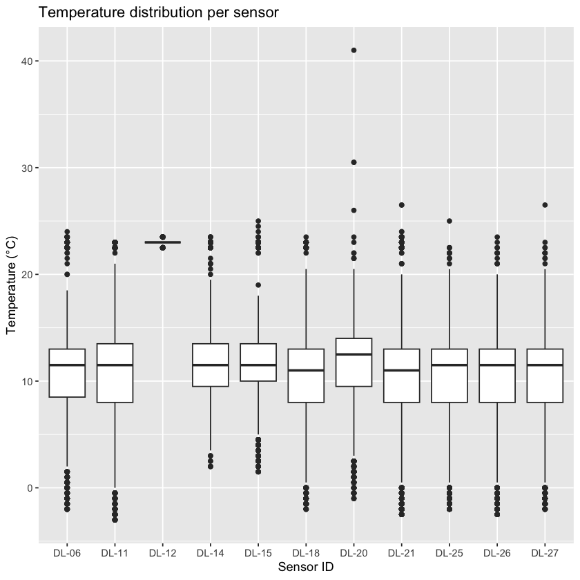
If you see values far outside the main cluster, they might be outliers or errors. However, remember: not all extreme values are mistakes, a sudden heat spike could be real. Always think carefully before you remove any points from your data set.
Quick detour: Comparison to station data
Go online to explore historic weather data:
Look for temperature time series covering your measurement period. Compare:
Are the daily patterns similar?
Is the temperature range realistic for the time of year?
Were any extreme values recorded?
If you find differences between your data and the station observations data, what could be possible reasons?
Identifying outliers
There are several ways to identify outliers. The table below summarizes three common methods with their pros and cons.
You already did the visual inspection; Z-score and Interquartile Range (IQR) method are described in more detail below.
Do you expect to get the same outliers with different methods?
Method | How It Works | Pros | Cons |
|---|---|---|---|
Visual | Use boxplots or scatterplots to spot unusual points visually. | Quick, intuitive, and easy to spot obvious anomalies. | Not systematic; subjective; may miss subtle outliers. |
Z-score | Calculate how many standard deviations a value is from the mean. | Fast to compute; effective for bell-shaped (normal) data. | Misleading for skewed data or when extreme values distort mean and SD. |
Inter-quartile range (IQR) | Flags points outside 1.5×IQR below Q1 or above Q3 percentiles. | Robust to skewed data; less influenced by extreme values. | May label valid extreme values as outliers, especially with small sample sizes. |
Z-score method for outlier detection
The Z-score measures how far each value is from the mean, in units of standard deviations:
A Z-score of 0 = exactly the mean.
A Z-score of +2 = two standard deviations above the mean.
A Z-score of –3 = three standard deviations below the mean.
For normally distributed data, 99.7% of values lie within ±3 standard deviations. Values beyond this range are flagged as potential outliers.
all_data_Z <- all_data %>%
  # Compute Z-score per sensor_id
  group_by(sensor_id) %>%
  mutate(
    temperature_Z = (
      (temperature - mean(temperature, na.rm = TRUE))
      / sd(temperature, na.rm = TRUE)
    ),
    temp_outlier_Z = abs(temperature_Z) > 3
  ) %>%
  ungroup()

# Check what that added
print(head(all_data_Z))
# A tibble: 6 × 8
observation_id datetime temperature humidity dewpoint sensor_id
<int> <dttm> <dbl> <dbl> <dbl> <fct>
1 1 2025-10-06 09:00:00 22.5 48 10.9 DL-06
2 2 2025-10-06 09:15:00 22.5 48 10.9 DL-06
3 3 2025-10-06 09:30:00 22.5 48 10.9 DL-06
4 4 2025-10-06 09:45:00 22.5 48 10.9 DL-06
5 5 2025-10-06 10:00:00 22.5 48 10.9 DL-06
6 6 2025-10-06 10:15:00 22.5 48 10.9 DL-06
# ℹ 2 more variables: temperature_Z <dbl>, temp_outlier_Z <lgl>
Interquartile Range (IQR) Method for Outlier Detection
The IQR method focuses on the spread of the middle 50% of the data. It calculates the difference between the 25th percentile () and the 75th percentile (), called the interquartile range (IQR). Values falling below or above are considered potential outliers.
# Use the IQR method to flag temperature outliers per sensor
all_data_IQR <- all_data %>%
  group_by(sensor_id) %>%
  mutate(
    # Temperature IQR
    temp_Q1 = quantile(temperature, 0.25, na.rm = TRUE),
    temp_Q3 = quantile(temperature, 0.75, na.rm = TRUE),
    temp_IQR = temp_Q3 - temp_Q1,
    temp_outlier_IQR = if_else(
      temperature < (temp_Q1 - 1.5 * temp_IQR) | temperature > (temp_Q3 + 1.5 * temp_IQR),
      TRUE, FALSE, missing = FALSE
    ),
  ) %>%
  ungroup()

# Check what that added
print(head(all_data_IQR))
# A tibble: 6 × 10
observation_id datetime temperature humidity dewpoint sensor_id
<int> <dttm> <dbl> <dbl> <dbl> <fct>
1 1 2025-10-06 09:00:00 22.5 48 10.9 DL-06
2 2 2025-10-06 09:15:00 22.5 48 10.9 DL-06
3 3 2025-10-06 09:30:00 22.5 48 10.9 DL-06
4 4 2025-10-06 09:45:00 22.5 48 10.9 DL-06
5 5 2025-10-06 10:00:00 22.5 48 10.9 DL-06
6 6 2025-10-06 10:15:00 22.5 48 10.9 DL-06
# ℹ 4 more variables: temp_Q1 <dbl>, temp_Q3 <dbl>, temp_IQR <dbl>,
# temp_outlier_IQR <lgl>
Visualize temperature over time with outliers highlighted
# Plot using IQR outlier flags
p1 <- ggplot(
  all_data_IQR,
  aes(x = datetime, y = temperature, color = temp_outlier_IQR, group = sensor_id)
) +
  geom_point() +
  geom_line() +
  facet_wrap(~sensor_id) +
  scale_color_manual(values = c("black", "red")) +
  labs(
    title = "Temperature over Time (IQR Outliers)",
    x = "Datetime",
    y = "Temperature (°C)",
    color = "Outlier"
  ) +
  theme_minimal()

# Plot using Z-score outlier flags
p2 <- ggplot(
  all_data_Z,
  aes(x = datetime, y = temperature, color = temp_outlier_Z, group = sensor_id)
) +
  geom_point() +
  geom_line() +
  facet_wrap(~sensor_id) +
  scale_color_manual(values = c("black", "blue")) +
  labs(
    title = "Temperature over Time (Z-score Outliers)",
    x = "Datetime",
    y = "Temperature (°C)",
    color = "Outlier"
  ) +
  theme_minimal()

# Combine plots side-by-side
p1 + p2 + plot_layout(ncol = 1)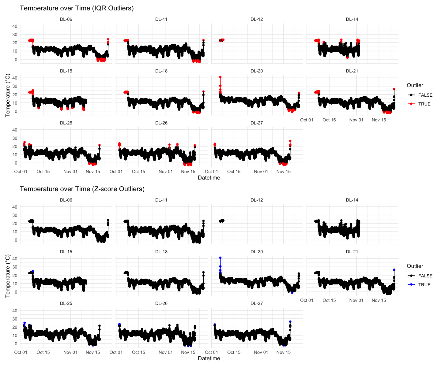
Read and add sensor location
You will have recorded metadata such as habitat type, location coordinates, or notes about the sensor placement during your field experiment in an Excel spreadsheet. The rest of the module will add extra data on the differences between the sensor location sites, but for now we can simply look to see if there are any differences between habitats recorded using Epicollect for the NHM and Silwood sites.
# Read meta data
metadata <- read.csv(sensor_metadata_file, as.is=TRUE)

# Get the site location using longitude
metadata$site <- ifelse(metadata$long_Sensor_location > -0.5, "NHM", "Silwood")

# Save the required fields to a smaller data frame
habitat_classification <- metadata[,c("Logger_SerialNumber", "Habitat", "site")]
names(habitat_classification) <- c("sensor_id", "habitat", "site")

habitat_classification$site <- factor(habitat_classification$site)
habitat_classification$habitat <- factor(habitat_classification$habitat)
Summarize maximum temperature per sensor
The following analysis focuses on the IQR data set; try the same steps with the Z-score or other alternative methods in your own time.
# Remove outliers and NAs before summarising
summary_data <- all_data_IQR %>%
  filter(!temp_outlier_IQR, !is.na(temperature)) %>%
  group_by(sensor_id) %>%
  summarize(max_temperature = max(temperature), .groups = "drop") %>%
  left_join(habitat_classification, by = "sensor_id") # add metadata

# Display summary table
print(summary_data)
# A tibble: 11 × 4
sensor_id max_temperature habitat site
<chr> <dbl> <fct> <fct>
1 DL-06 18.5 Woodland Silwood
2 DL-11 21 Woodland Silwood
3 DL-12 23 Woodland Silwood
4 DL-14 19.5 Woodland Silwood
5 DL-15 18 Woodland Silwood
6 DL-18 20.5 Woodland Silwood
7 DL-20 20.5 Woodland NHM
8 DL-21 20 Woodland Silwood
9 DL-25 20.5 Other Silwood
10 DL-26 20 Woodland Silwood
11 DL-27 20.5 Woodland Silwood
Fit ANOVA: max temperature ~ location
ANOVA (Analysis of Variance) is a statistical method used to test whether the means of a continuous variable differ significantly across two or more groups.
Test whether the max temperature is predicted by location. What do you expect?
# Fit ANOVA
anova_model <- lm(max_temperature ~ habitat, data = summary_data)
summary(anova_model) # View ANOVA table
Call:
lm(formula = max_temperature ~ habitat, data = summary_data)

Residuals:
   Min     1Q Median     3Q    Max
 -2.15  -0.40   0.00   0.35   2.85

Coefficients:
                Estimate Std. Error t value Pr(>|t|)
(Intercept)       20.500      1.375  14.905 1.19e-07 ***
habitatWoodland   -0.350      1.442  -0.243    0.814
---
Signif. codes:  0 ‘***’ 0.001 ‘**’ 0.01 ‘*’ 0.05 ‘.’ 0.1 ‘ ’ 1

Residual standard error: 1.375 on 9 degrees of freedom
Multiple R-squared:  0.006499,	Adjusted R-squared:  -0.1039
F-statistic: 0.05887 on 1 and 9 DF,  p-value: 0.8137
Boxplot maximum temperature - habitat type relationship
ggplot(summary_data, aes(x = habitat, y = max_temperature)) +
  geom_boxplot(fill = "lightblue", alpha = 0.6) +
  geom_jitter(width = 0.1, size = 2, alpha = 0.7) +
  labs(
    title = "Maximum Temperature by Habitat Type",
    x = "Habitat Type",
    y = "Max Temperature (°C)"
  ) +
  theme_minimal()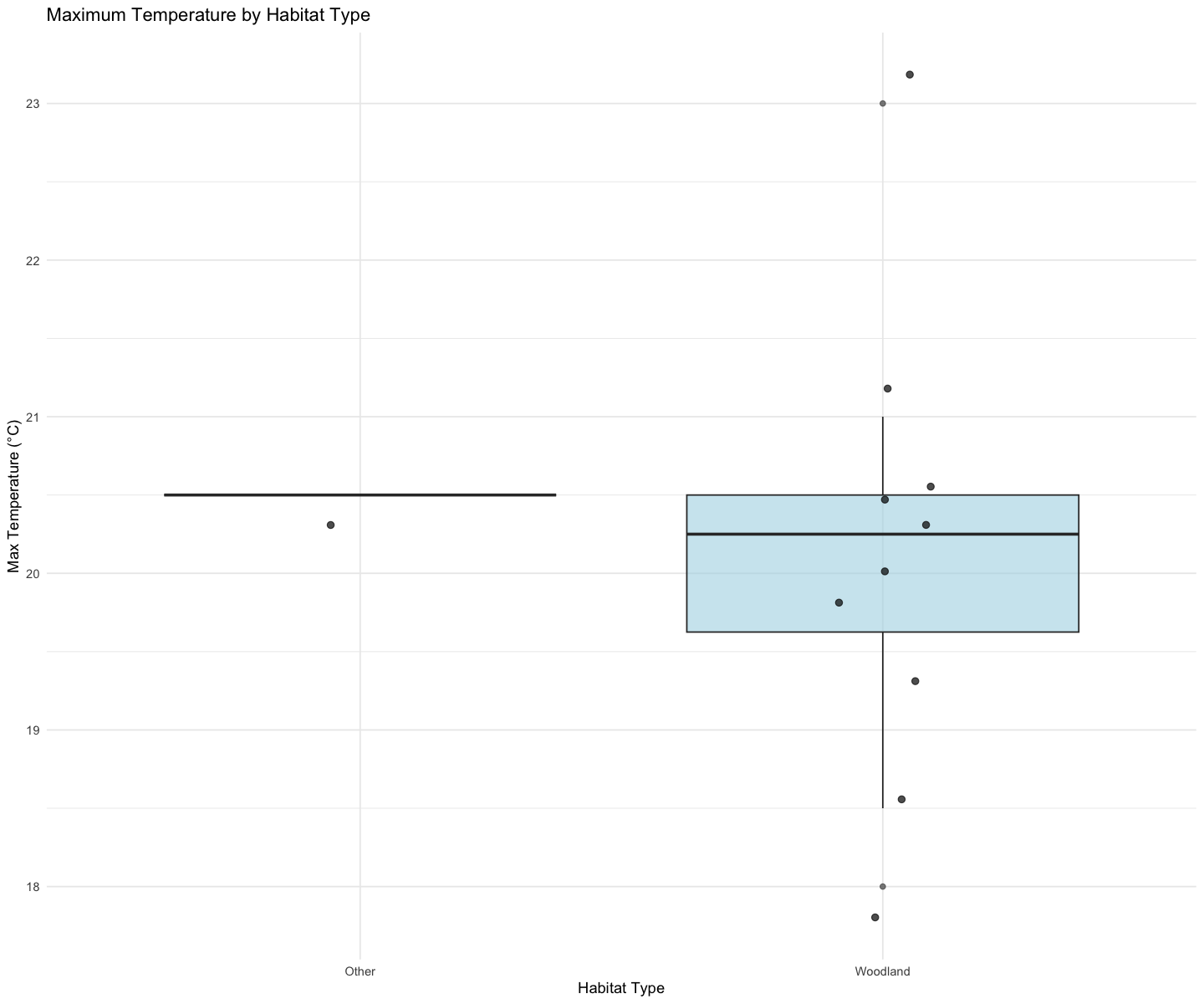
Export new data set
This is a good moment to export the combined data set from all sensors, including information on IQR and outliers.
write.csv(all_data_IQR, file.path(sensor_data_folder, "all_sensor_data_2025.csv"))Optional extensions
Now that you are familiar with the dataset, go explore other variables, statistics, or relationships, for example:
Plotting humidity vs. habitat type
Looking at the diurnal cycle (average daily pattern)
Comparing spatial variation between sensors
Reflection Tasks
1. Descriptive statistics paragraph
Write a short summary of:
Your dataset (number of sensors, time range, variables measured)
Any unusual patterns or outliers
How your measurements compare with official weather station data
2. Interpretation of modelling results
In ~300 words, explain:
What your ANOVA shows
Whether this result supports your hypothesis