Statistics
Statistics is an umbrella term for a lot of different activities involving data.
Statistical Thinking is needed at every stage of a research project:
- Formulation of hypotheses
- Planning and design of the study
- Data collection
- Data processing
- Data exploration
- Data analysis
- Interpretation of results
- Presentation of results
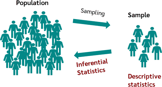
Sampling
The data that we work with has to be collected in some way.
In almost every situation, we will not have access to complete information about the things we are studying. We will have to make do with a partial view.
The things that we have data for are called the sample.
The complete set of things that we would like to learn about in our study make up the population.
In some cases the population is in principle infinite because the object of study is a process that can be repeated as many times as we like (e.g. rolling a die).
The sample is a part of the population, often just a very tiny part.
Sampling Strategies
When working with a finite population, there are many ways that we could choose the individuals that we sample, e.g.:
Convenience sampling
- choose those easiest to access
Simple random sampling
- every individual has the same probability of being chosen
Stratified random sampling
- identify subpopulations, then build a random sample so that each subpopulation makes up the same proportion in the sample as it does in the population
Systematic sampling
- order the population in some way and choose individuals at regular intervals from the list
Areas of Statistics
It is helpful to distinguish between two quite different kinds of activity, both of which are thought of as "doing statistics".
Descriptive Statistics
This is the set of tools for exploring, summarising and presenting information about the sample itself.
A statistic is a number that we calculate from the sampled data in order to summarise it in some way, e.g.
- the sample mean, $\bar{x}$
- the sample standard deviation, $s$
Inferential Statistics
This is the set of tools that we use to draw conclusions about the population, based on the data that we have collected.
A parameter is a number that describes the population in some way. It forms part of a theoretical model for the population and cannot be directly observed, e.g.:
- the population mean, $\mu$
- the population standard deviation, $\sigma$
Keeping these two kinds of activity clearly separated can help us to be much clearer about when we are thinking about the sample vs. the population.
Data
Data comes in two basic flavours and each flavour has two subtypes.
Quantitative Data are numerical, arising from counting or measurement processes.
Categorical Data (also known as factors) are simply labels that we use to define groups of individuals.
Quantitative Data
There are two types of quantitative data:
Continuous Data are measurements with values that can be placed somewhere on a defined interval.
They may be more or less precise, often depending on the precision of the equipment used for measurement.
Examples include:
- blood pressure of a patient
- thickness of a steel sheet
- mass of a planet
Discrete Data are also numerical, but are only allowed to take values from a defined set.
For counting processes, this will often be the set of non-negative integers, but some measurement processes can also produce discrete data.
Examples include:
- number of insects caught in a trap in one night
- number of neutrino interactions detected in one hour
- excitation level of a hydrogen atom
Categorical Data
There are also two types of categorical data:
Nominal Data have values taken from a set of category labels that has no meaningful ordering.
Examples include:
- type of a rock (sedimentary/igneous/metamorphic)
- species of an insect
- manufacturer of a resistor
- binary data (yes/no, true/false etc.)
Ordinal Data have values taken from a set of labels that does have a meaningful order, but no meaningful quantitative relationship between labels.
Examples include:
- grade of a tumour (1/2/3/4)
- developmental stage of a fly (egg/larva/pupa/adult)
- level of agreement with a statement (e.g. on a Likert scale)
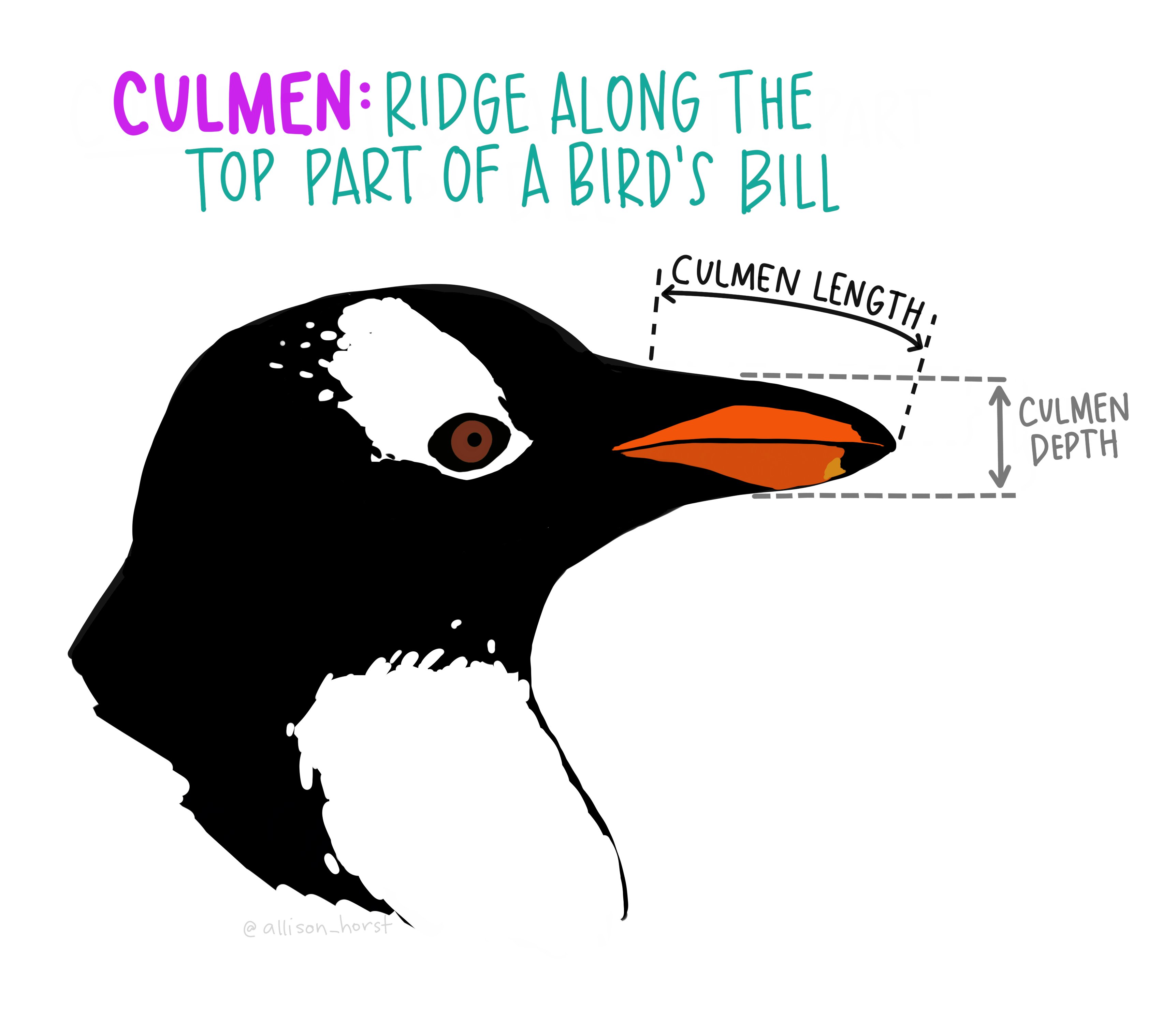
species,island,culmen_length_mm,culmen_depth_mm,flipper_length_mm,body_mass_g,sex
Adelie,Torgersen,39.1,18.7,181,3750,MALE
Adelie,Torgersen,39.5,17.4,186,3800,FEMALE
Adelie,Torgersen,40.3,18,195,3250,FEMALE
Adelie,Torgersen,NA,NA,NA,NA,NA
Adelie,Torgersen,36.7,19.3,193,3450,FEMALE
Adelie,Torgersen,39.3,20.6,190,3650,MALE
Adelie,Torgersen,38.9,17.8,181,3625,FEMALE
Adelie,Torgersen,39.2,19.6,195,4675,MALE
Adelie,Torgersen,34.1,18.1,193,3475,NA
...
This is a dataset about penguins in Antarctica. You can read more about it here.
We will use the pandas package in python to work with tabular data.
The table of data is held as an object called a DataFrame
| species | island | culmen_length_mm | culmen_depth_mm | flipper_length_mm | body_mass_g | sex | |
|---|---|---|---|---|---|---|---|
| 0 | Adelie | Torgersen | 39.1 | 18.7 | 181.0 | 3750.0 | MALE |
| 1 | Adelie | Torgersen | 39.5 | 17.4 | 186.0 | 3800.0 | FEMALE |
| 2 | Adelie | Torgersen | 40.3 | 18.0 | 195.0 | 3250.0 | FEMALE |
| 3 | Adelie | Torgersen | NaN | NaN | NaN | NaN | NaN |
| 4 | Adelie | Torgersen | 36.7 | 19.3 | 193.0 | 3450.0 | FEMALE |
| 5 | Adelie | Torgersen | 39.3 | 20.6 | 190.0 | 3650.0 | MALE |
| 6 | Adelie | Torgersen | 38.9 | 17.8 | 181.0 | 3625.0 | FEMALE |
| 7 | Adelie | Torgersen | 39.2 | 19.6 | 195.0 | 4675.0 | MALE |
| 8 | Adelie | Torgersen | 34.1 | 18.1 | 193.0 | 3475.0 | NaN |
Each column in the table is one variable.
Each row in the table is one individual (data point).
We can check the number of rows in the table using len():
344
A one-dimensional Series object represents a single variable:
0      Torgersen
1      Torgersen
2      Torgersen
3      Torgersen
4      Torgersen
         ...
339       Biscoe
340       Biscoe
341       Biscoe
342       Biscoe
343       Biscoe
Name: island, Length: 344, dtype: object
Missing data
Notice that a few of the values in the table are missing, shown as NaN in python.
It is a good idea to check how many of these there are for each variable.
Unexpected missing values may sometimes indicate problems in reading the data from the file.
species               0
island                0
culmen_length_mm      2
culmen_depth_mm       2
flipper_length_mm     2
body_mass_g           2
sex                  11
dtype: int64
Exploring Data with Python
We will be using some visualisation tools from the matplotlib python package.
For many of the plots that we make, there are convenience methods accessible directly on the pandas data objects that invoke the matplotlib commands.
Sometimes we will have to work directly with matplotlib, which needs a bit more work.
This course will not be focusing on the details of either pandas or matplotlib - other training is available for both of these packages!
However, you will be able to learn from the example code how to do the basics.
Exploring Categorical Data
Frequency Table
When working with categorical data, a frequency table is the most direct way to summarise the sample.
We can use a Series to show the counts for a single variable:
island
Biscoe       168
Dream        124
Torgersen     52
Name: count, dtype: int64
We can also make a cross-tabulation, e.g. to see which species live on which islands:
| species | Adelie | Chinstrap | Gentoo |
|---|---|---|---|
| island | |||
| Biscoe | 44 | 0 | 124 |
| Dream | 56 | 68 | 0 |
| Torgersen | 52 | 0 | 0 |
Pie Chart
This is a simple way of giving a general impression of the relative proportions of each category.
It is difficult to read accurately as it is very hard to compare angles by eye.

Bar Chart
A much more easily readable version of the data is given by a bar chart.

There is one bar per category and the height of the bar is proportional to the count.
We can represent multiple count series as a side-by-side bar chart ...

... or as a stacked bar chart.

Exploring Quantitative Data
Histogram
A histogram is a simple way to visualise the distribution of a quantitative variable.

The x-axis is split into chunks called bins.
The area drawn in each bin is proportional to the number of data that fall into that bin.
Usually we work with histograms that have equal bin width, in which case the y-axis can be marked directly as a frequency.
However histograms with unequal bin widths are sometimes used for special purposes.
Sometimes we want to show multiple histograms on the same axes:

Violin Plot
A more readable way of comparing distributions for subpopulations is to use a violin plot.

Each histogram is smoothed using kernel density estimation (KDE) and mirrored to produce a "violin" shape. The minimum and maximum are also shown here.
Scatter Plot
To explore the relationship between two quantitative variables, we can use a scatter plot.

Each data point is shown with a marker, located on an x-y plane defined by the two variables of interest.
We can colour the data points in various ways.
Representing a quantitative variable on a colour map:

Representing a categorical variable using a small set of colours:

Scatter Matrix
For a set of quantitative variables, this is a convenient way to view all of the histograms together with scatter plots showing the relationship between every pair of variables.
